

University of Waterloo Student Union: Rebrand
my title: Graphic Designer
duration: June – Aug 2019
Project
Re-branded the University of Waterloo Student Union
Purpose
The Federation of Students (FEDS), the former name of the university student union, was proven not recognized throughout student life on campus.
The majority of students did not identify with the brand nor understood its meaning or purpose for undergraduates.
My Role
As a lead designer, my main role was to assist in understanding the brand and developing it from the ground up. I did a lot of creating, presenting, and deciding.
Team
1 full-time graphic designer (me)
2 part-time designers
1 full-time marketing staff
Skills
Adobe Illustrator
Adobe Photoshop
Adobe After Effects
Collaboration
Communication
Dedication
Result
The rejuvenated brand allowed us to take a new tone of voice and implement different ways of reaching the student body.
Process
I joined the team after the initial survey and data collecting but caught up to aid in facilitating focus groups. These efforts were to better understand our users and take a data-driven approach to our design. With the team, we created a cohesive brand, all starting with a new name and acronym, Waterloo undergraduate student association. WUSA. Shortly after, I assisted in creating a new logo, a colour scheme, typeface, assets, illustration styles, and photoshop presets.
50 years since The University of Waterloo’s student union underwent a rebrand. I hope that my efforts in this rebrand stick around for another 50 years.
FROM FEDS, TO WUSA


STACKED LOGO
The stacked logo was designed for social media and any other situation where the primary logo does not work.


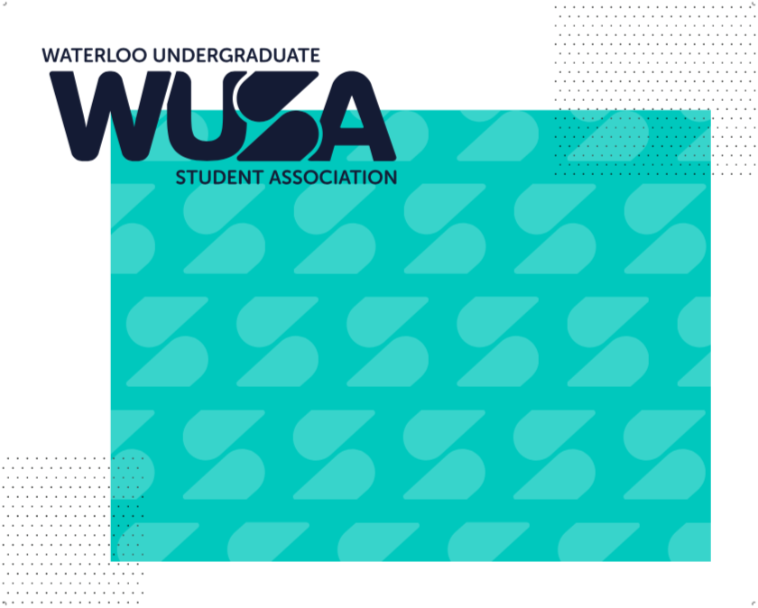
RESPECTIVE ‘S’
The respective ‘S’ is a highlight in our chosen logo design. The ‘S’ can be manipulated with any pattern, or picture to eventuate events, topic, or seasons.
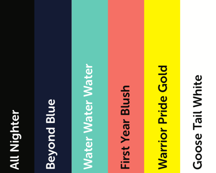
COLOUR
The University of Waterloo used colour to differentiate the faculties of study. The Student Union is also aids the faculty societies. This limited our colour choices a lot, as blue, teal, purple, orange, pink, and green.
To link WUSA to the university we chose to select one of their three yellow options.
Our team decide on 2 neutral colours, being the black and navy blue, and two accent colours the light blue/green, and coral colour. This way we have a full range of colours to play with, in opposition of the original.
Talking about accessibility and comparing and reviewing Pantone books our pallet was complete.
WORKING EXAMPLES
In trying to sell our ideas and logo concepts to the execs and marketing staff, I created mockups of our ideas and presented them in a way they can envision the item.


Under the team, I created everything from the sign that hangs over the office, to handout social media cards.
This photo shows..
- Letterhead
- WUSA pen
- WUSA promo stickers
- Reusable bottle design
- WUSA’s carnival volunteer t-shirts
- A social media handout card
- A pin for the full time staff
- A prize give-away sipper pouch
- An orientation week performance rebranded logo and program.
SIGNAGE
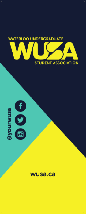
This is my design for the Pull Up Banner, used at all WUSA events.
This is the design for the Photo Wall. It frames the subjects and doesn’t hide the logo. It is not the typical company backdrop, repeating the logo over and over, but it does repeat the more recognizable part that can later become a stand alone element.
FUTURE APPLICATION OF THE LOGO & SUB-BRANDS

The Women’s Center is a service under the student union that is always promoted with both logos. Liking them together will show the linkage between the two.
In the future, the idea of removing the services logos, and form new WUSA logos for each service is a possibility.
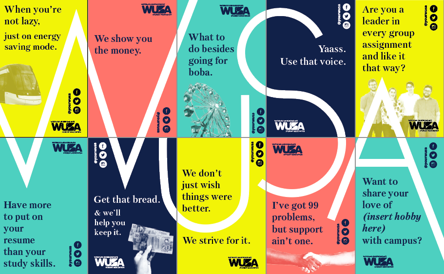
PROMOTION
My actions to promote the rebrand and help incoming students understand what WUSA is and does. IK pitched this promotion idea.
This is a poster and flyer series, designed to promote the student union. I wanted to illustrate what the the student union does covering the major aspects and how they all fit together to make WUSA.
These posters have a punchy phrase, that the students will pick up on.