I LOVE dance and graphic design! And being the Head of Social Media for the University of Waterloo’ s Dance Company was an incredible experience. Let me show you what I have been up to….
BACKGROUND
As a university dance team, the members of the team are all so different. We all come from different cities, or even provinces, training with different backgrounds, yet we all come together and DANCE.
As a team we have come a long way from previous years. In moving up the rankings we as a team wanted to give us a new visual presence.
In this, we needed a fresh new look to help the dancers on the team feel rejuvenated and refreshed to take on the new year.
CONCEPT & IDEATION

Our Competition
Half the team use their school logo or school athletics logo and throw DANCE TEAM at the bottom. Other teams created their own logo. Heat is one of Westerns dance teams that created their own logo (middle picture above).

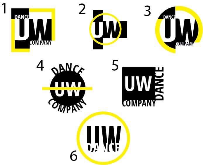
I think of our team as bold, audacious, and bursting out the seams with passion. These qualities call for bold text and shapes. With this, I wanted the high contrast from the black and white, along with our school colour yellow.
After narrowing it down covering and expanding ideas multiple times. These 6 logo designs were one of the presented stages, sent it off to the rest of the executive team for the next cut in hopes to decide on one final design.
They all agreed as it was their second choice and replied with “you obviously know better then us engineer and science students”.
FINAL LOGO DESIGN
Round Logo for Instagram and other social media accounts with a rounded profile thumbnail.
Getting out there…
Before I even got to Waterloo, I needed to focus on attracting incoming first year students, as well as the upper year students. I constructed this poster to promote our Facebook page, well as University of Waterloo Facebook groups.
My posters and advertising came into fruition using the boldness and simplicity of the logo in the design.
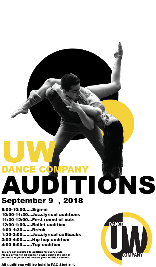
After making the poster and putting it out in Facebook groups. I commented on members profiles if they introduced themselves as a dancer. This insured we got direct attention from potential members.

The purpose for the cover photo version of the poster was to display the vital information of the dance team. This was the first glance of our event group as well as our UW Dance Facebook Page.
The short video was a fast informative compilation of clips from one of our competitions strung together to show our abilities and inform our followers about the audition.
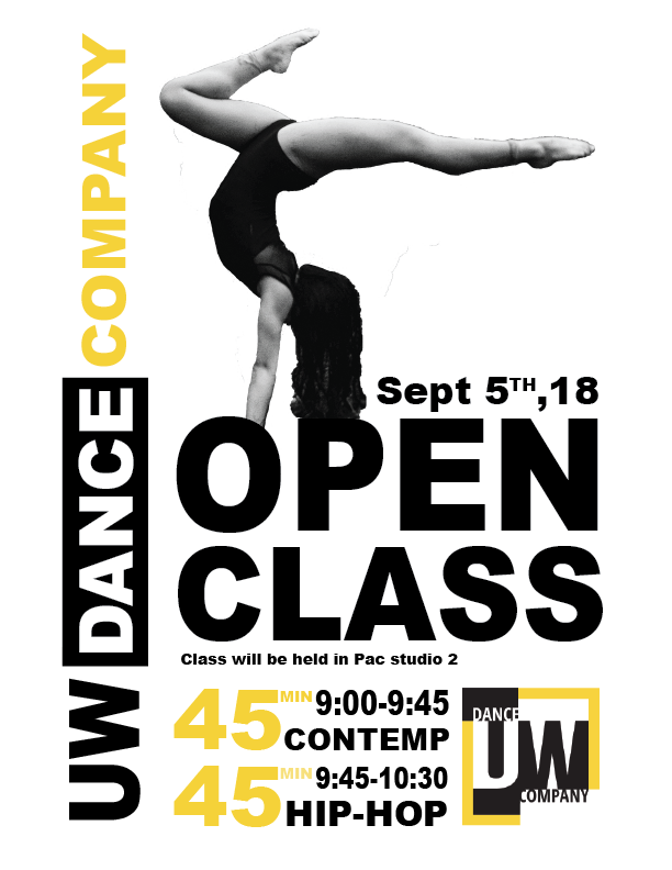
Consistency was a key in factor in designing media for our open class sessions. We wanted to target the same people that were attending our auditions and dance in general. Changing the feature dancer gave incentive to look at the new poster, but constancy was provided in the information and design.

FUNraizing

When running fundraiser events, there was a lack of visual presence, and customers had no idea who they were purchasing donuts from. Creating this banner gave us a multipurpose physical visual aid that could be used at multiple events.
It brought more traction to our social media accounts, and led people to ask more questions about our team the second time we ran this event.
Showcase


Poster was designed to catch peoples attention as their walking down the hallways to get to class. It was used to present our annual showcase.
I used a Pinterest board (https://www.pinterest.ca/mairimorassut/uw-dance/) to get inspired and brain storm ideas.
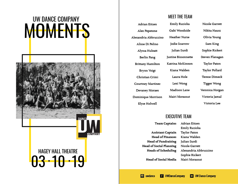
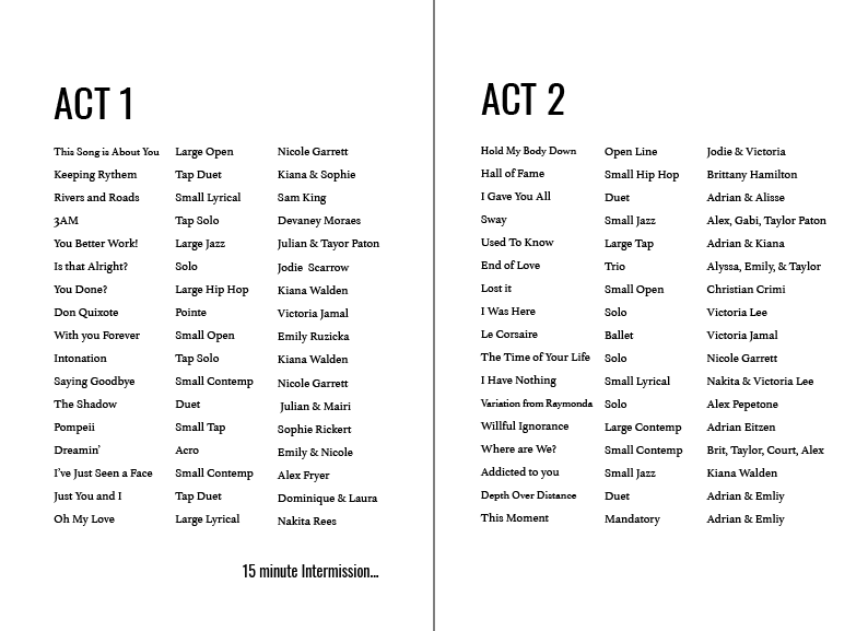
I built a simple program, to insure the audience stays informed and on pace with the acts. It also acts as a keepsake for the team members, as a memory of the dances and members of the team in 2019.
This Promo video is another short compilation to promote the Showcase and ensure turnout (no pun intended) at our annual event.
Moments start with each and every one of us, and together we created this show, sharing so many moments together along the way.
I wanted the sentence above to come out through the intro of the promo video and let the contextual information proceed. Incorporating everyones head shots made it personal. I shows that each and everyone of us put our heart and soul into the year and making it this far to show it off.
The show had a great turnout and was a great way to show off our seasons work.
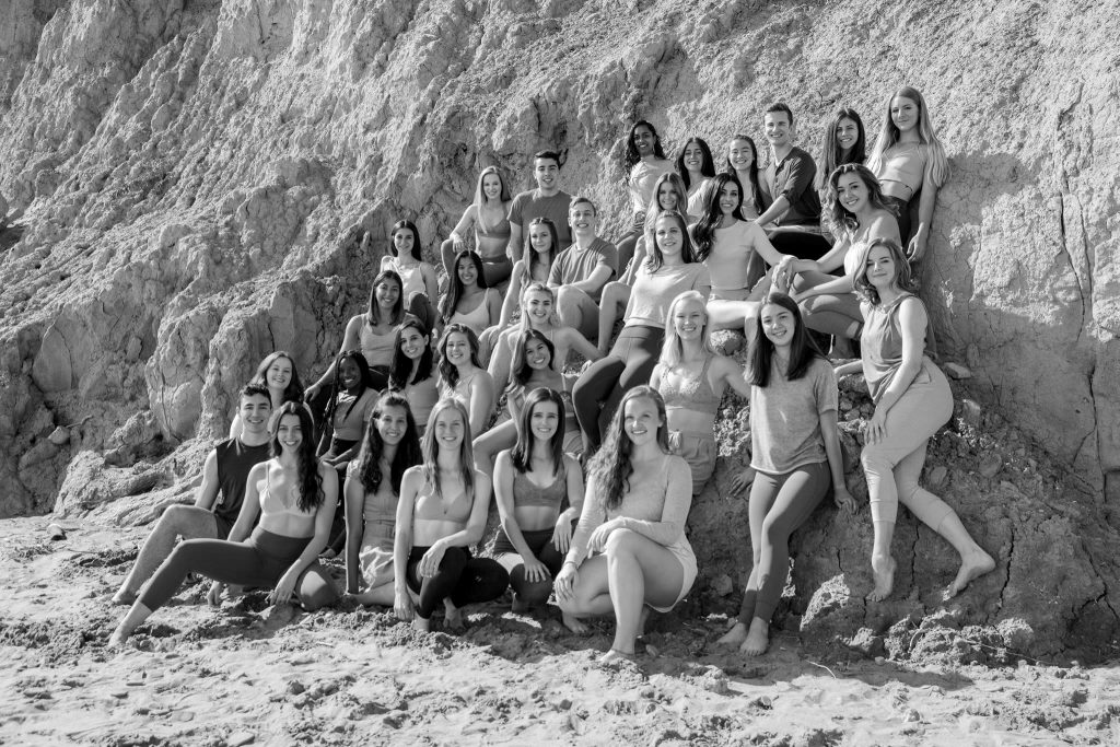
Overall, the journey with the company this year has been terrific. I have learned a lot about myself as a person and a graphic artist. My skills have improved and gave me a foot in the door into seeing what works and what doesn’t. The company gave me the opportunity to actually create and publish for a cause and people that I truly care about.
I hope that the design and promotion ideas this I have set up will assist and the up coming members taking my place, and that they are able to develop further off my knowledge and work.
