Project Description
Case Study
Waterloo Undergraduate Student Association
Graphic Designer for Company Rebrand
May – September 2019
Background
WUSA is a student-led organization that represents the undergraduates at the University of Waterloo. They provide support and services students need to reach their academic goals.
Problem
The Federation of Students (FEDS), the former name of the university student union, was proven not recognized throughout the student life on campus.
The majority of students did not identify with the brand nor understood its meaning or purpose for undergraduates.
Role
As a lead designer, my main role was to understand the brand and develop it from the ground up. I did a lot of creating, presenting, and deciding.
Team: 1 full-time graphic designer (me), 2 part-time designers, 1 full-time marketing staff
Skills
- Adobe Illustrator
- Adobe Photoshop
- Adobe After Effects
- Collaboration
- Communication
- Dedication
Process
I joined the team after the initial survey and data collecting but caught up to aid in facilitating focus groups. These efforts were to better understand our users and take a data-driven approach to our design.
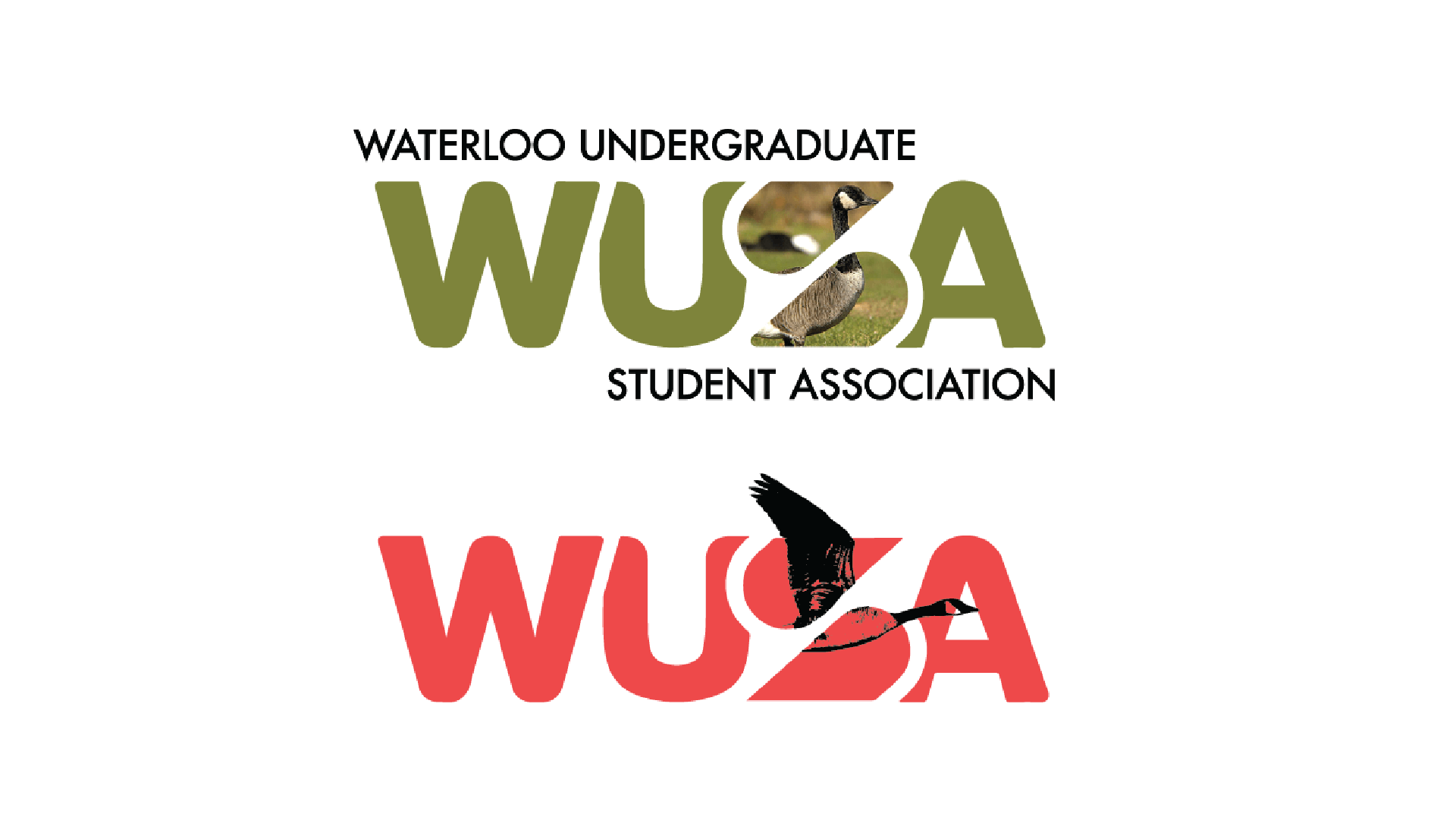
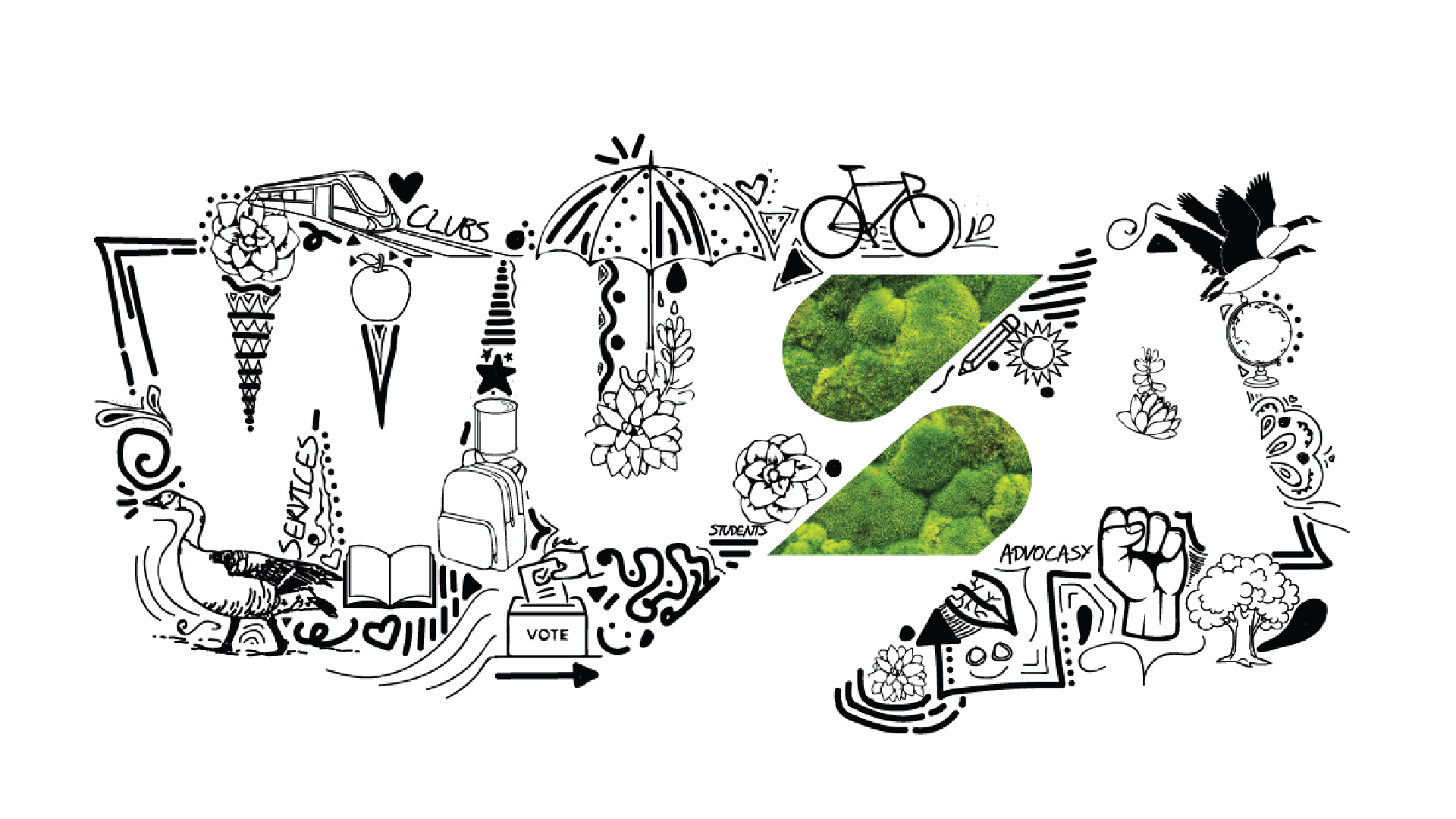
After a new name and acronym, Waterloo undergraduate student association, WUSA, was decided, we individually brainstormed concepts and ideas. These revolved around different elements like the Waterloo Warriors figure, our Lion mascot, the infamous Geese on campus, the universities high tech nature, and student life.
This was a long process of diverging and converging ideas and designs.
We landed on the idea of a responsive element in the logo. This would allow us to incorporate every element and concept that makes up the diverse student body at the University. The responsive element became the ‘S’ for Students.
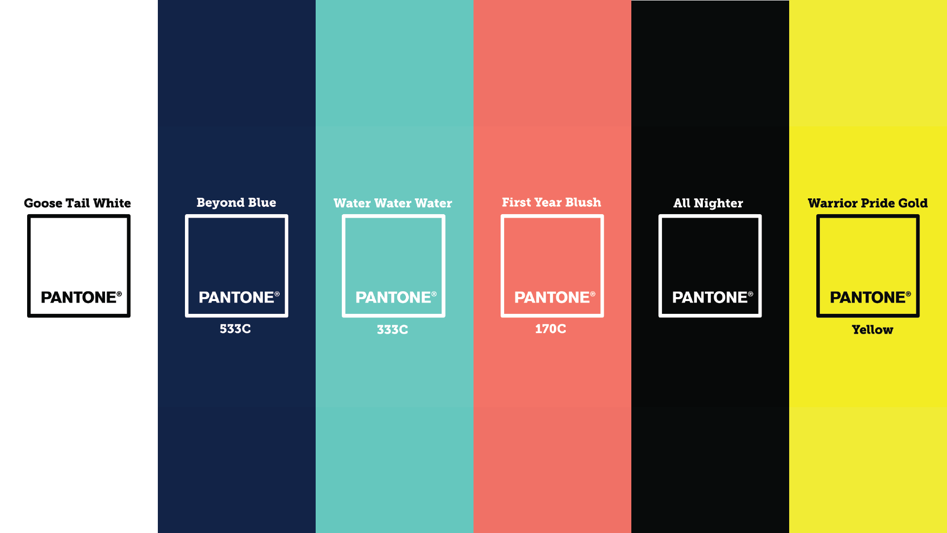
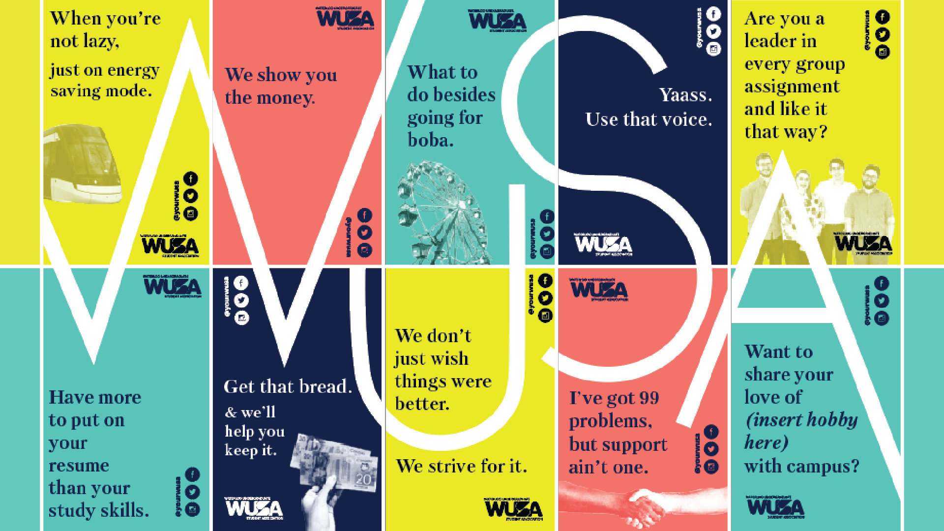
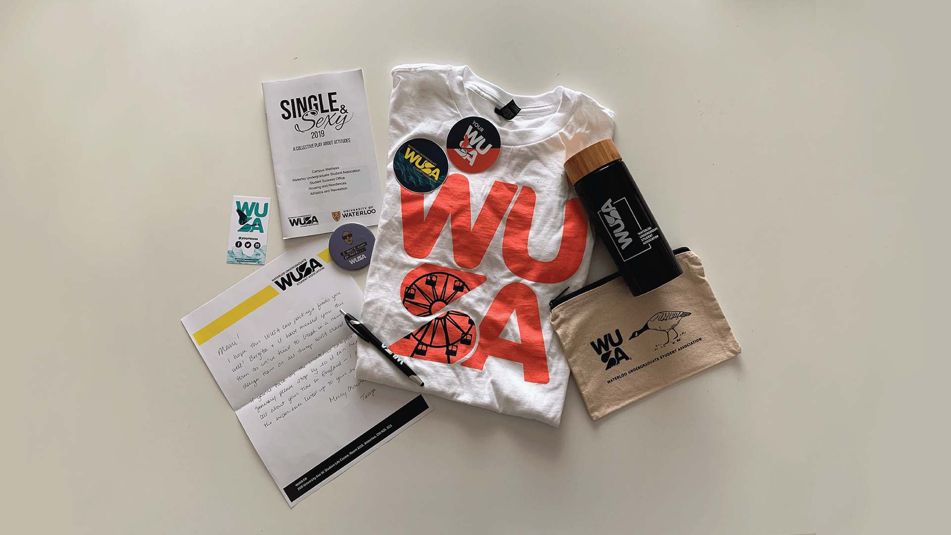
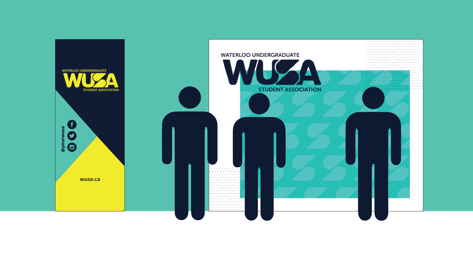
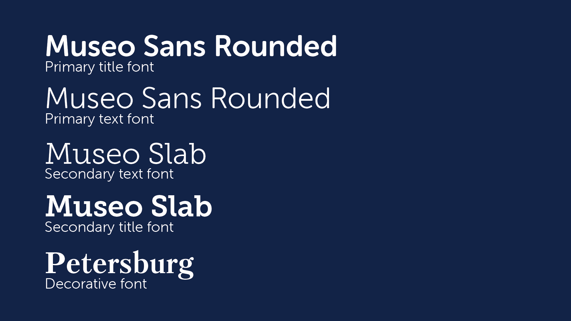
Shortly after, I assisted in altering and creating the new logo. A colour scheme, typeface, assets, illustration styles, and photoshop presets came shortly after through meetings and intense research on accessibility, associations, and longevity. Each element reached it full form through many iterations, diverging and deliberating.
Once our project team was satisfied with the results throughout each phase the project manager would present our work to the executive directors and the head of the Marketing department. They had the final say in what directions and designs we chose.
Result
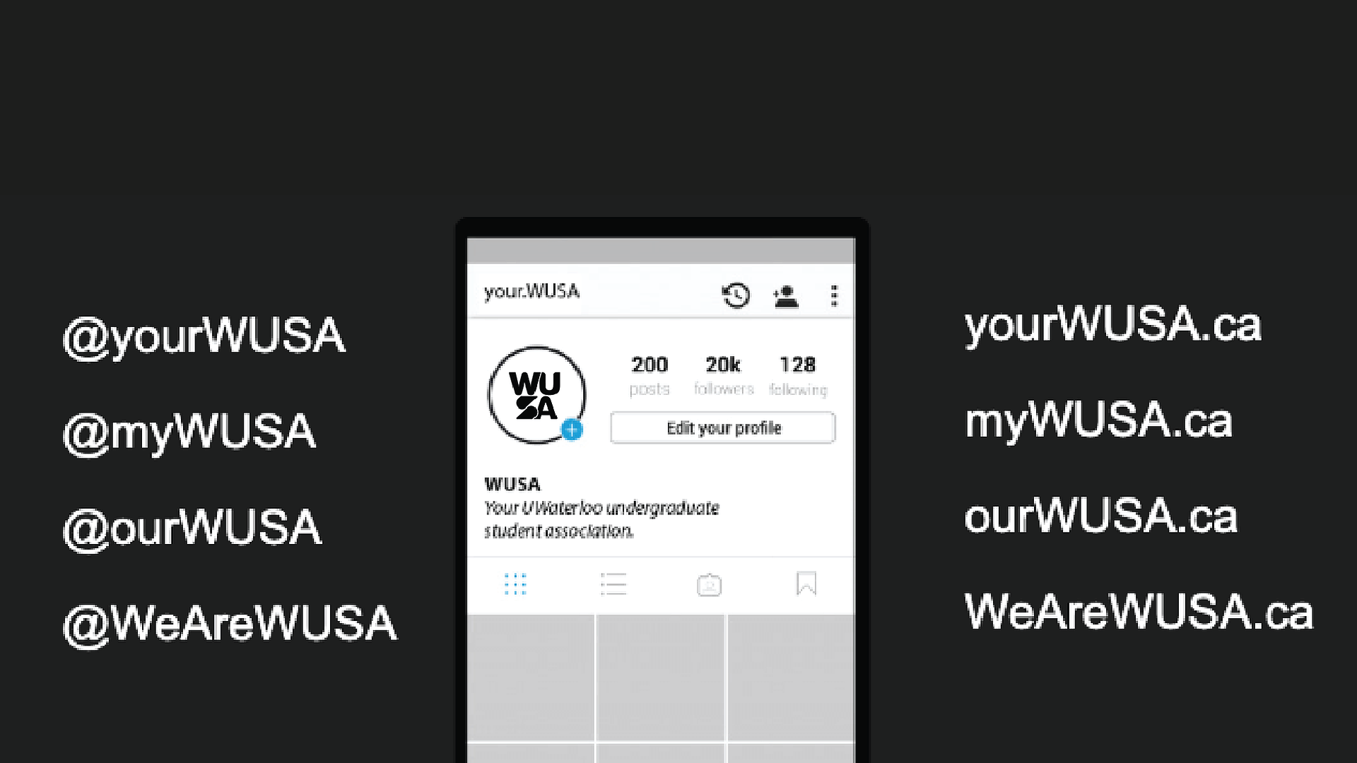
The rejuvenated brand, allowed us to represent the organization in a youthful and refreshed way. This was proven effective with an increased social media following and engagement. As well as a better turn out to events run by all branches under WUSA.
50 years since The University of Waterloo’s student union underwent a rebrand. I hope that my efforts in this rebrand stick around for another 50 years.


