Project Description
Case Study
DISRUPTION Festival
Graphic Designer
Nov – Dec 2019
Background
Warp records is a British independent record label and was holding the event. This weekend long arts festival surrounded groundbreaking artists. Not only were artists like Apex Twin and Boards of Canada performing but Visual artists, over performers and vendors would display their work over the 3 days.
Problem
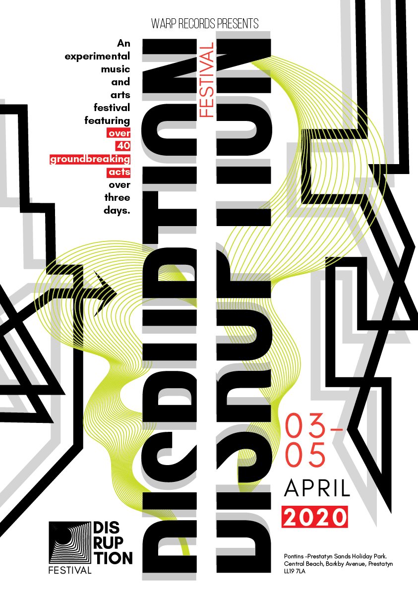
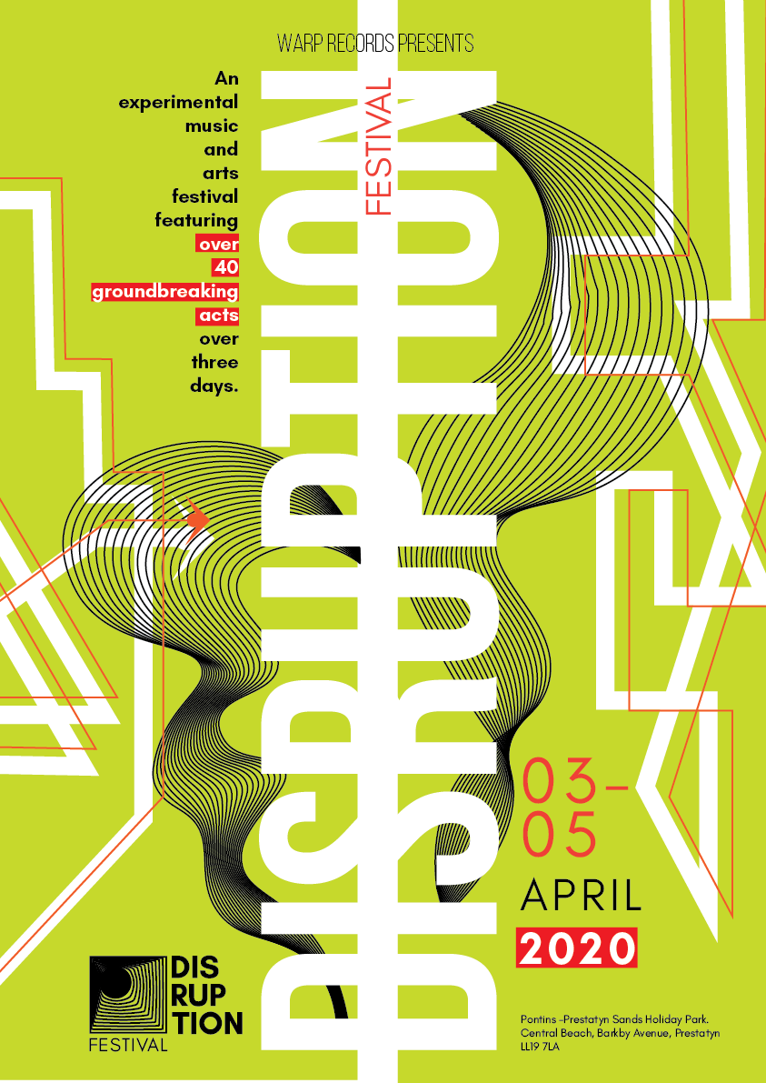
Client needed a brand identity, poster design, 3 animations for instagram, and a take away item for the Disruption Festival.
Role
Sole designer.
Skills
- Branding
- Animation
- UX Research
- Adobe Indesign
- Adobe Illustrator
Process
I served my peers, their definition of disruption, and built personas around them. The 2 main quotes that stuck with me throughout the design process was “Disruption is something blocking or stopping something” and “Makes you change directions”. This feedback gave me a user centered position to view the branding.
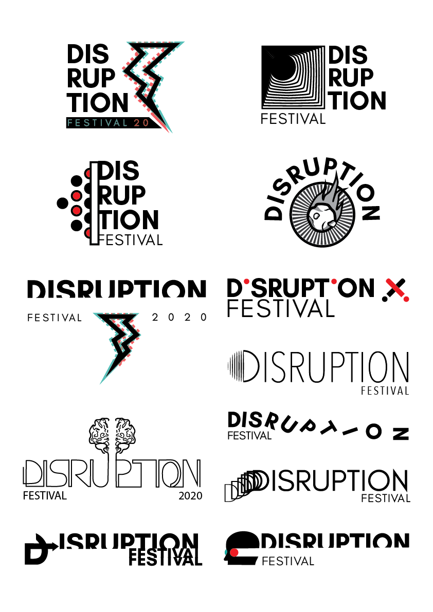
I sketched out many logo concepts bringing off my data, and digitized them in Illustrator. After deliberation and guidance form my professors.
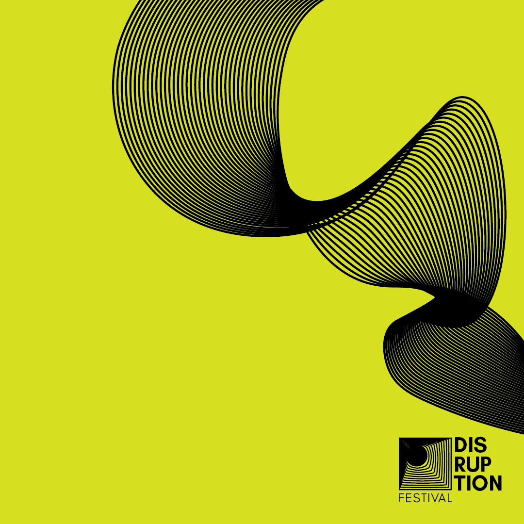
The colour of the poster design was inspired by the Bon Iver 2020 tour poster. The electric disrupted my view and stole my attention, distracting me from walking straight down the street.
The 3 animation videos are driven by the idea of disruption causing a change in direction. They were created in Adobe After Effects.
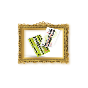
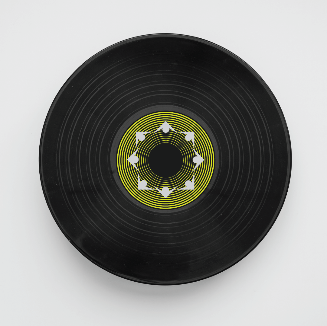
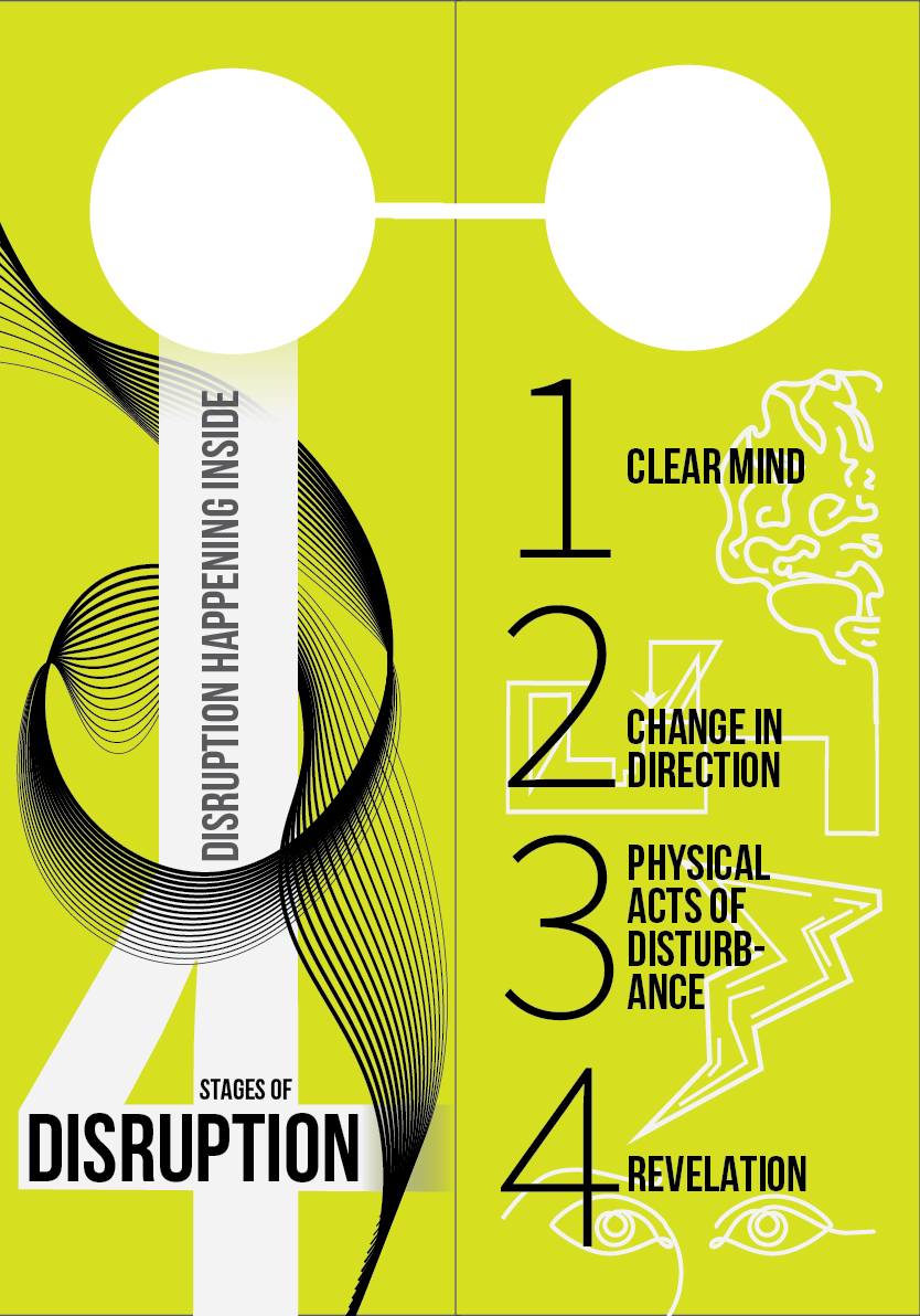
The door sign take away came from the idea of a disruption preventing someone from entering a room. The multi page document goes through 4 stages of disruption and reads do not disrupt on the front. Meanwhile the idea is disruption is happening inside the room while listening to the songs of the headliner from the weekend on the vinyl record I designed.


