

INTRODUCTION
The Annual Disruption Festival is a three-day experimental music and arts event presented by Warp Records (warp.net) occurring at Pontins – Prestatyn Sands Holiday Park. The festival will feature over 40 musical performances from artists such as Aphex Twin, Battles, Autechre, Boards of Canada, Brian Eno, Bibio, Flying Lotus and Children of Alice.
Performance styles showcased at this event are experimental and avant-garde, all prime representatives of cutting edge alternative music. The festival will also integrate experimental and avant-garde film, during intermissions and during most performances to produce a multimedia experience for attendees.
I undertook a range of tasks and produce design solutions, which will form
part of a coherent campaign for the above festival.
RESEARCH
Primary source
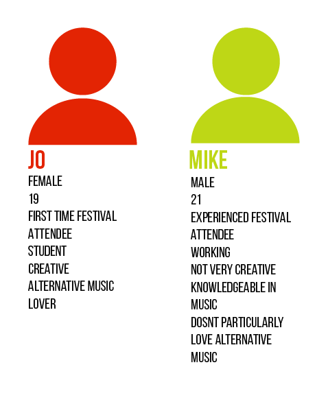
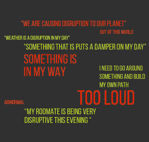
I asked my peers “What does Disruption mean?” & “Use it in a sentence for me.” I turned them into personas…

Bon Iver 2020 tour posters, seen around Leeds, inspired my colour choice… as it caught my eye walking to school every day.
In the Dublin Art Book Sale, I was inspired by a few books….
Transdisciplinary Practice, by Lynda King & Oonagh Young (the book cover design- influenced my logo design)
Out of Thin Air by Daragh Muldowney (photography of reflected ice in water, creating disruption in the water and an odd appearance of the ice form)


Yve Ludwing Graphic Designs for Yale Architecture.
What works in these pieces of design…
- movement through the page with the line work
- disrupted text by white blocked strips
- text placed on its side is dynamic
- eye catching
Another influencer…
The movie deux jours, une nuit translates to Two Days, One Night (2014) uses objects in between the characters to show the disconnection in the relationship. There is a physical object disrupting the conversation and frame.
How could I market Disruption Festival differently?
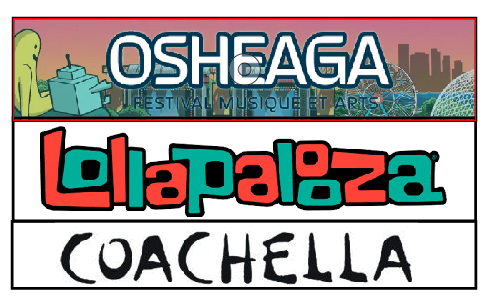
- centered
- no icon
- long in length
- busy marketing assets
Goal is to make it take up more space, have an icon, be off centered
LOGO DEVELOPMENT


FINAL LOGO
The icon represents…
- music traveling through space
- changing shape from the circle to the square
- imitates a speaker shape
- arrowhead element, made up of
- the lines tightly lined up
Typographic choices…
- I choose to split up the word ‘disruption’ to visually represent the word
- it is disruptive to read
- keeps your eyes moving
- clean and respectable event
- a clean recognizable look
If you took apart any of the elements of the final logo, for example the arrowhead you could still recognize its Disruption Music Festival.
I choose this logo over the others because…
- it can attract both personas (music fanatic or not, and creative or not)
- appears respectable, safe, yet fun and exciting
- the prospects of the event shine through the logo
COLOUR SCHEME
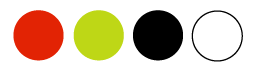
The yellow-green & red-orange colour scheme is bold and electrifying, as well as being complementary to each other. The high contrast between the black and white along with the green and red makes it dynamic.
POSTER


Final poster design
- Turning the title on its side and splitting it in half created the disruption in the poster.
- It also created a center line on symmetry.
- The visual element on the layout created movement.
- The green line wave relates to the musical element of the festival.
- The arrow line, ties in the arrow head of the logo, and highlights the tittle of the festival. It is the focal point in the design.
- It also relates to how going to the event will ignite change in the consumer.
- Hierarchy of info is present with text size and highlighted info.


“Disruption is something blocking or stopping something”
“Makes you change directions”
A do not disturb sign on a door will stop a person from entering making them change previously planned actions, and move on.
Taking a twist on a classic object…
- Do Not Disrupt vs. Do Not Disturb
- multi page A3 document, with circular hole and slit on the side, cut out
- why not disrupt? Because Disruption is happening inside…
- 4 stages of disruption (mimicking the stages of grief)
- a humours piece of art for the audience to take home
- make use out of the document
- continues the use of assets in the brand
- unique design


An album sticker and cover sleeve design, featuring one song from each artist performing.
Incorporated elements form the poster design in a more simplistic way.
Make the logo more disruptive!
- Animate the elements to bring the logo to life.
- Can be used on more mediums. ex. On the large screens at the event, and/or to end promotional videos.
First Animation
- indicate the business with the animated the logo at the start
- disrupt it more – add transitions
- separate each element of the logo and make it come to life
- tell the story of the logo , and
- where each element come from
The Middle Animation
- gets the information across first
- gets disrupted…
- and shows the festival
- make it very different from the other two…
- invert the order of information
Third animation
- mimic the first animation but highlight the festival in a different way
- use other elements of the brand
- similar animation layouts create unity among the different versions.